
Inventory & Procurement


Maintenance KPI Excel - Free Template
Track work orders, downtime, labor, costs, SLA performance, and uptime with a maintenance KPI dashboard.
2026-07-06
220 downloads
4.8/5
Download template
This maintenance KPI Excel template tracks work orders, downtime, labor, parts cost, SLA results, and uptime in one workbook. It includes a data-entry sheet, a dashboard, and a lists sheet so you can monitor maintenance performance without building formulas from scratch.
Use it to follow preventive and corrective work, compare planned versus actual downtime, and see whether technicians are hitting SLA targets. The workbook is set up for practical maintenance reporting, not theory.
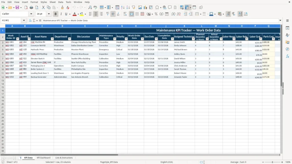
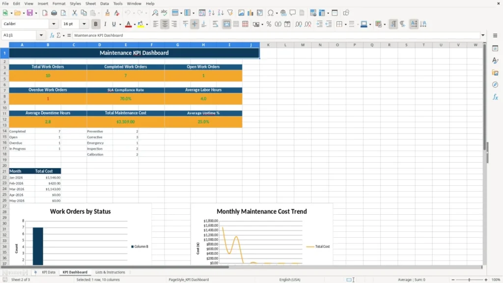
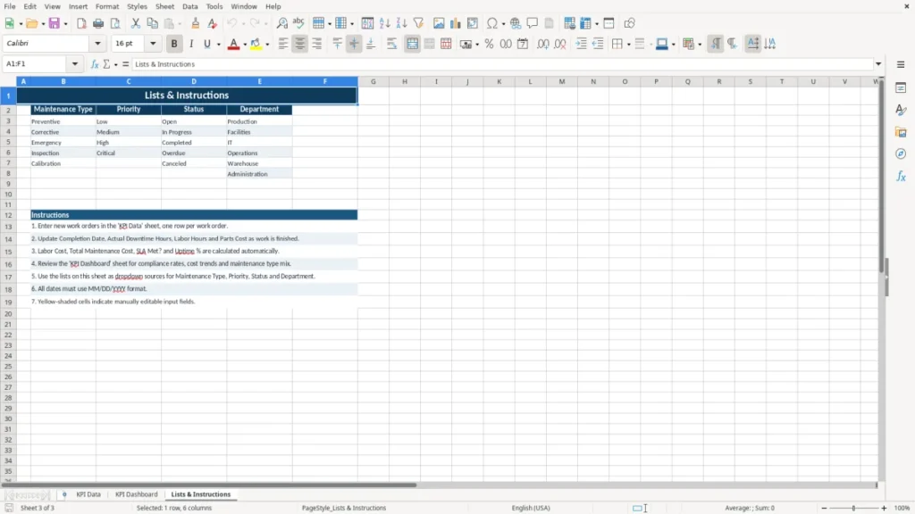
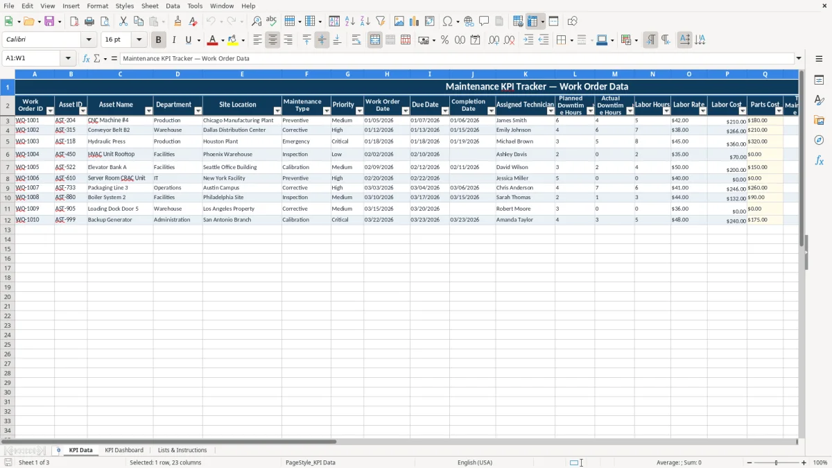
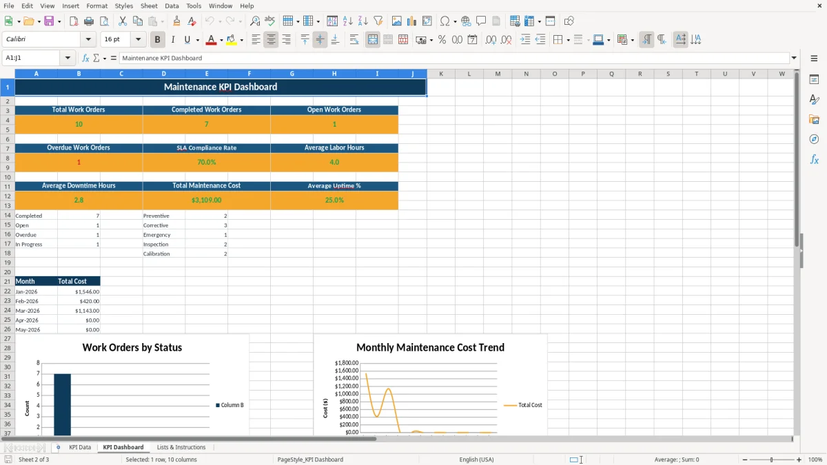
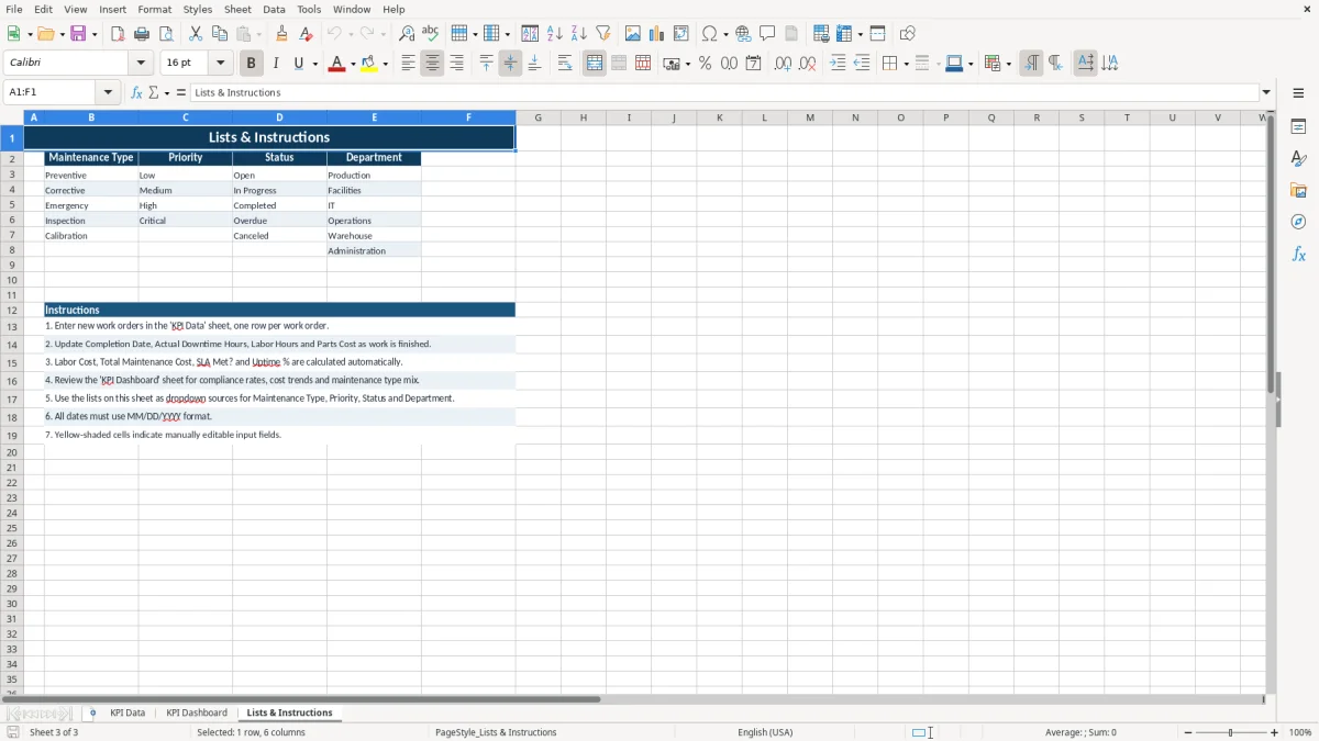
The KPI Data sheet (image 1) is where you enter each work order. KPI Dashboard (image 2) turns those entries into charts and summary metrics, and Lists & Instructions (image 3) stores the dropdown values used across the file.
The main benefits of this Excel template
- Tracks each work order with clear fields for asset, department, site, technician, and status.
- Lets you compare planned downtime against actual downtime on every job, so misses stand out fast.
- Calculates labor cost, parts cost, and total maintenance cost in one place.
- Shows SLA performance with a simple met/not met result for each work order.
- Helps you monitor uptime % across assets instead of guessing from scattered notes.
- Cuts reporting time at month-end by keeping all maintenance data in one workbook.
- Gives a manager or supervisor a clean dashboard view without manual chart building.
Step-by-step guide
- Open KPI Data and enter one row for each work order. Use the same Work Order ID format every time so records stay easy to sort.
- Fill in the dates, technician, downtime hours, labor rate, parts cost, and status. A job with 6 labor hours at $42.50 and $180 in parts should land at a total maintenance cost of $435.00 before you review it.
- Check the dropdown fields and pick values from the lists sheet instead of typing freehand. That keeps maintenance type, priority, and status consistent.
- Review the formulas for SLA Met?, total cost, and uptime after each entry. If a completion date is blank, the row should stay open until the job is finished.
- Go to KPI Dashboard to review the charts and summary blocks. Use it at the weekly operations meeting or at month-end close to spot overdue work and cost spikes.
- Copy the tab structure forward each month or quarter if you want a fresh reporting period. If you outgrow the workbook and need live CMMS dispatching, move to maintenance software instead of forcing Excel to do job scheduling.
What is included
Work order table with fields for asset, department, site, technician, dates, downtime, labor, parts, and notes.
SLA tracking that flags whether each job met the target hours.
Labor cost and total maintenance cost formulas tied to labor rate, hours, and parts.
Uptime % field for asset performance monitoring.
Dashboard-style summary that turns raw work order data into visual performance reporting.
Dropdown-ready setup for cleaner input on maintenance type, priority, and status.
Instruction sheet that helps you keep the file consistent across reporting periods.
Who uses a maintenance kpi spreadsheet in the field
This kind of file fits the people who have to explain maintenance performance with numbers, not stories. A plant supervisor tracking 40 work orders a month, a facilities manager at a 12-unit apartment portfolio, or a maintenance lead at a contractor with 4 technicians all need the same basic view: what broke, how long it took, and what it cost.
The KPI Data sheet gives you one row per work order, so you can compare a $275 bearing swap against a $2,400 motor replacement and see the difference in labor, parts, and downtime. That is far more useful than a stack of service notes.
Where the workbook fits in weekly work
Use it during the weekly maintenance review, after a shutdown, or at the end of a production week. If one machine misses 3 planned hours and ends up at 9 actual downtime hours, that gap shows up fast in the table and on the dashboard.
Why the image layout matters
Image 1 shows the input sheet built for data entry, image 2 shows the dashboard for managers, and image 3 shows the lists sheet that supports clean selections. That structure works well when one person enters data and another person reviews it.
What the dashboard and reporting view can show
The dashboard is the part most maintenance teams will actually use. It turns the raw data into summary views for uptime, downtime, cost, SLA results, and open work so you can spot the problem assets without sorting 200 rows by hand.
For example, if a site logs 60 work orders in a month and 14 are still open after 48 hours, you can see the backlog instead of guessing from email threads. If 9 of 10 preventive jobs meet the SLA but 3 emergency repairs do not, the pattern is obvious.
Technical structure that keeps the file usable
The workbook is organized around a data table on KPI Data, then summary output on KPI Dashboard. That is the right setup when you want charts and KPIs to update from the same source rows instead of copying numbers into a second sheet.
Why this matters for reporting cadence
At month-end, a manager may need a clean readout for labor cost, parts cost, and uptime for 1 site or 8 sites. A dashboard built from structured rows is faster than rebuilding a report every Friday.
Where maintenance reports usually break down
The most common failure is sloppy input. If one tech types Preventive, another types PM, and a third leaves the field blank, your counts become useless and your dashboard lies by omission.
Another problem is mixing planned and actual downtime. If planned downtime is 2 hours but actual downtime is 7 hours and nobody records both, you lose the reason the job ran long and you cannot defend the extra labor cost.
Bad numbers create bad decisions
Say a technician works 8 hours at $38.00 per hour and parts run $160.00. That should produce $464.00 in labor cost plus parts, not a vague note like “service completed,” because the missing math can hide a $150 overrun on a small repair.
What a clean structure prevents
A work order sheet with separate fields for completion date, SLA target hours, and status helps you catch overdue jobs before month-end. If 5 jobs slip past the due date, you can see the delay in hours and dollar cost instead of discovering it after the plant manager asks for answers.
How to turn the template into a maintenance routine
This file works best when you tie it to an existing habit, not when you hope people remember to fill it out later. The easiest pattern is to update KPI Data at the end of each shift, then review KPI Dashboard every Monday morning or at the payroll run.
Simple habits that keep it alive
- Enter each closed work order before you leave the job so the completion date and downtime stay accurate.
- Copy the previous month’s file forward so your layout and formulas stay intact.
- Use dropdown lists for priority and status so you do not end up with 12 versions of the same label.
- Check the dashboard once a week for jobs that are still open past the SLA target.
If your team reaches a point where 150 to 200 work orders a month need live dispatching, parts inventory, and technician scheduling, Excel stops being the right tool. At that point, move to CMMS software and keep the workbook as a reporting backup.
Frequently asked questions about this template
It is used to track work orders, downtime, labor cost, parts cost, SLA results, and uptime in one workbook. That gives you a clear maintenance scorecard instead of scattered notes and email updates.
The template includes KPI Data, KPI Dashboard, and Lists & Instructions. The first sheet is for input, the second is for reporting, and the third supports dropdowns and usage notes.
Yes. The Maintenance Type field is built for that purpose, so you can separate planned PM work from emergency repairs and compare the cost and downtime of each.
Enter planned downtime hours and actual downtime hours for each work order. If a job was expected to take 2 hours but took 5, you can see the 3-hour overrun immediately.
It shows whether the job was completed within the target hours you set in the SLA Target Hours field. That helps you measure response time and completion performance without manual checking.
Move to maintenance software when you need live scheduling, mobile technician updates, parts inventory, or a high volume of active work orders. If you are managing 150+ jobs a month, Excel is usually better as a reporting tool than as the main operating system.
Meet the makers