
Project & Planning


Bar Chart Excel Template
Create clear Excel bar charts to compare revenue, expenses, units, profit, categories, regions, and other business metrics.
2026-08-02
318 downloads
4.8/5
Download template
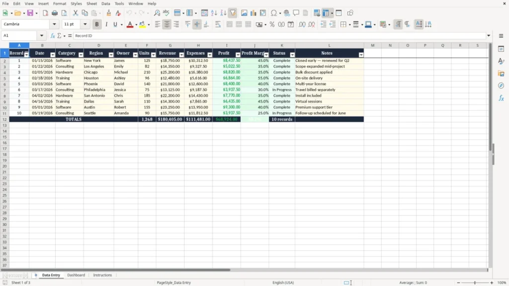
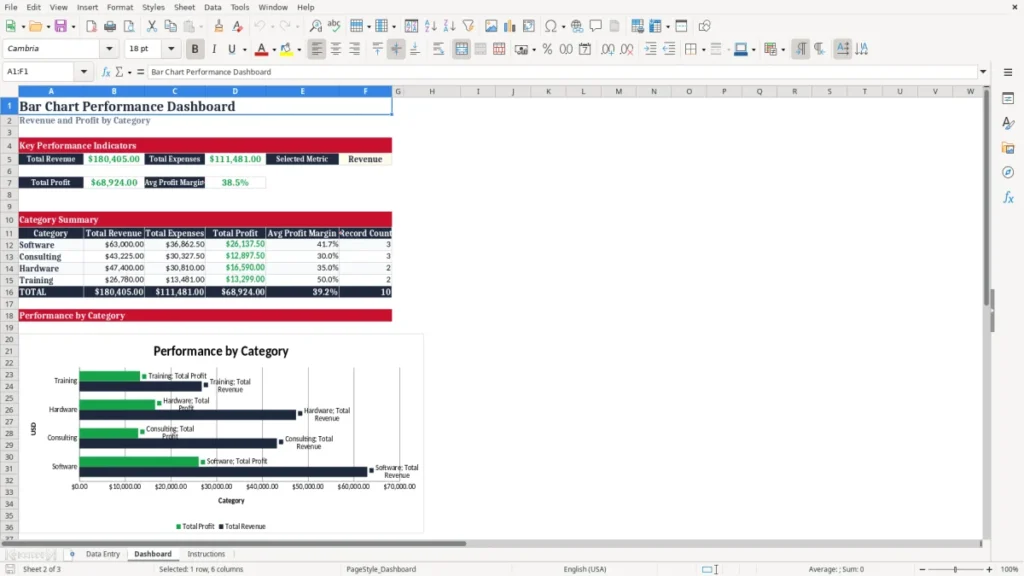
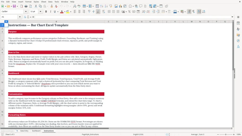
Turn business data into clear, professional comparisons with this bar chart Excel template. The workbook includes a structured Data Entry worksheet where you can record dates, categories, regions, owners, units, revenue, expenses, profit, profit margin, status, and notes. Sample records demonstrate how the layout works, and you can replace them with your own information.
Use the organized table as the foundation for charts that make sales results, operating costs, project performance, and other key metrics easier to understand. Whether you are preparing a management report, reviewing regional activity, or presenting category performance, this template helps you move from raw data to a useful visual with less setup time.
The main benefits of this Excel template
- Compare business values quickly across categories, regions, owners, or reporting periods.
- Organize operational and financial records in one clear, structured worksheet.
- Review revenue, expenses, profit, and profit margin alongside supporting business details.
- Start with sample records that demonstrate how the template can be used.
- Customize the data fields and chart selections for different reporting requirements.
- Present results in a clean, professional format suitable for meetings, reports, and presentations.
Step-by-step guide
Download and open the workbook in Microsoft Excel or a compatible spreadsheet application. Begin by reviewing the sample records in the Data Entry worksheet. Replace the sample record IDs, dates, categories, regions, owners, units, revenue, expenses, status, and notes with your own information.
Review the profit and profit margin fields to understand the performance of each record. Select the categories and numeric values you want to compare, then create or adjust a bar chart in Excel.
Update the chart title, colors, labels, legend, and layout so the visual matches your reporting needs. Add more records when required, and use the completed chart in dashboards, management reports, presentations, planning sessions, or team reviews.
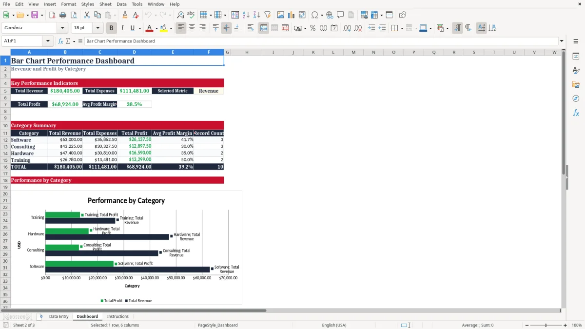
What is included
A formatted Data Entry worksheet with clearly labeled business and financial fields.
A bar chart-ready structure for comparing numeric values across meaningful categories.
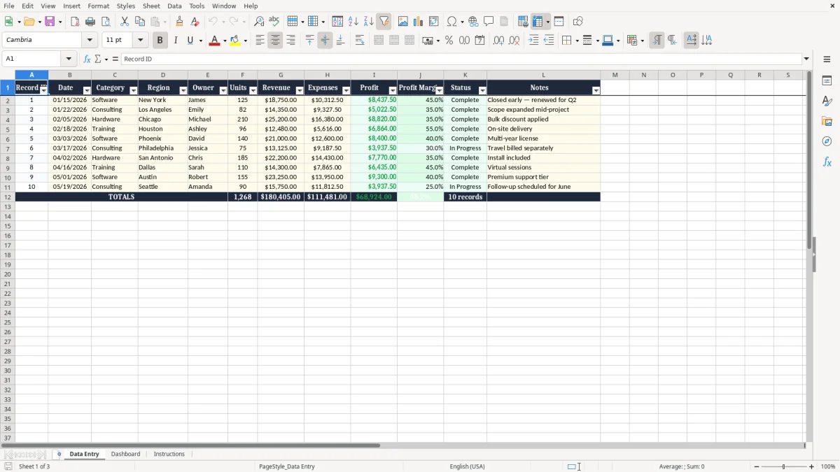
Fields for Record ID, Date, Category, Region, Owner, Units, Revenue, Expenses, Profit, Profit Margin, Status, and Notes.
Sample business records that demonstrate the intended layout and reporting workflow.
Professional formatting with readable headers, borders, spacing, and frozen panes.
A flexible design that can be adapted for sales, expenses, projects, inventory, or operational reporting.
What Is a Bar Chart Excel Template?
A bar chart Excel template is a prepared spreadsheet that helps you organize information and compare values visually. Instead of starting with a blank workbook, you receive a structured worksheet with labeled columns, consistent formatting, and a layout designed for chart-based reporting.
Bar charts are useful when you want to compare categories, regions, owners, products, projects, or time periods. The length of each bar makes differences easy to see, even when your audience does not want to study a detailed table.
This template includes a Data Entry worksheet with fields for Record ID, Date, Category, Region, Owner, Units, Revenue, Expenses, Profit, Profit Margin, Status, and Notes. Sample business records are included so you can understand how the information fits together before entering your own data. You can use the existing structure for sales analysis, financial comparisons, project reviews, operational reporting, or performance presentations.
The template is designed to save time while keeping source data organized. Replace the sample records, add new rows, adjust the fields, and select the values you want to display in a bar chart. Excel provides controls for changing chart titles, colors, labels, legends, and layouts, so the final visual can reflect your reporting style.
Whether you need a quick comparison for an internal meeting or a polished chart for a management report, this template gives you a practical starting point. It also helps keep the information behind your chart easy to review and update.
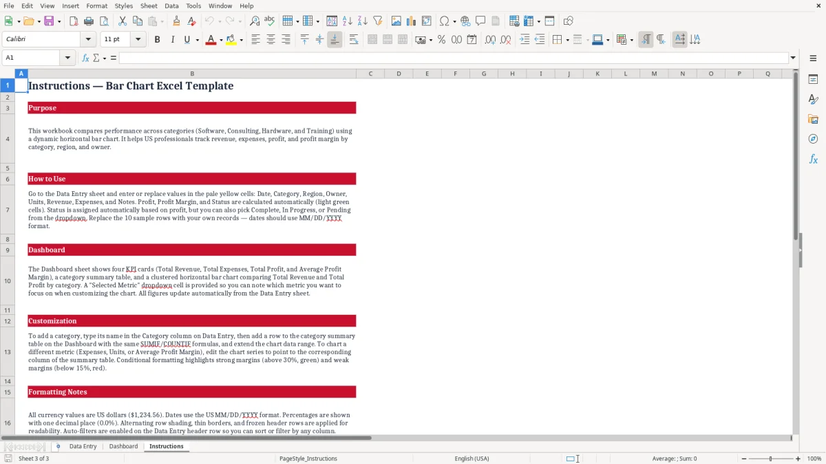
How to Use the Bar Chart Excel Template
Using the bar chart Excel template begins with the Data Entry worksheet. Open the workbook in Microsoft Excel or another compatible spreadsheet application, then review the sample records to see how the columns are arranged.
Each row represents a record, while the columns capture identifying information, business categories, financial values, and notes. This structure makes it easier to maintain consistent data before creating a visual comparison.
Replace the sample values with your own records. Enter a date, category, region, owner, units, revenue, expenses, status, and notes that help explain the result. Keep categories consistent when you want to group or compare them.
For example, use the same spelling for each region or product category so chart selections remain accurate. Review the profit and profit margin fields alongside the source values to understand the financial context behind each record.
Next, select the category and numeric fields you want to compare. You might compare revenue by category, expenses by region, units by owner, or profit across projects. Insert a bar chart in Excel, then customize its title, colors, data labels, legend, and layout.
If you add rows or change the source data, update the chart range so the visual includes the latest information. Before sharing the finished chart, check that labels are clear, units are correct, and the comparison supports the message you want to communicate. Save a clean version for recurring reports and reuse the workflow whenever new data becomes available.
For a recurring report, the same comparison workflow can feed a project return analysis when you need to compare revenue, costs, and profit across projects.
Business Uses for a Bar Chart Template
A bar chart Excel template can support many everyday business reporting tasks. Sales teams can compare revenue or units across categories, owners, regions, or reporting periods.
Finance teams can review expenses, profit, and profit margin, then create visuals that highlight the strongest and weakest results. Operations teams can compare activity levels, project outcomes, inventory movement, or service volumes without building a reporting structure from the beginning.
The template is also useful for presentations and management reviews. A well-organized bar chart can turn a long list of numbers into a direct visual comparison.
This makes it easier for stakeholders to identify differences, focus discussion, and decide where further analysis may be needed. The Notes field can preserve context such as discounts, scope changes, delivery details, renewals, or other factors that explain unusual results.
Because the worksheet includes dates, categories, regions, owners, units, revenue, expenses, profit, status, and notes, you can adapt it to different departments and reporting styles. A project manager may compare profit by project owner, while a sales manager may compare revenue by category. A regional leader may review units and expenses by location.
You can also use the sample records as a guide for creating a custom dataset. After entering your information, select the most relevant fields and adjust the chart design so the final output is useful for your audience. The same structure can support recurring weekly, monthly, or quarterly reviews.
The same recurring schedule also fits a project status report when you need to track several initiatives in weekly, monthly, or quarterly reviews.
Customize Your Excel Bar Chart
One advantage of this bar chart Excel template is its flexibility. The included Data Entry worksheet gives you a consistent starting point, but you can modify the workbook to reflect your own business terms and reporting priorities.
Replace the sample categories, regions, owners, dates, financial amounts, units, statuses, and notes with current information. Add records as your dataset grows or change column labels when a different workflow requires specialized fields.
Excel also provides many chart customization options. You can choose a horizontal bar chart or a vertical column-style comparison, depending on the amount of text in your category labels and the space available in your report. Update the chart title to describe the metric and period clearly.
Use data labels when exact values matter, and consider a legend when comparing more than one series. Colors can be adjusted to match your brand or distinguish positive and negative performance, while axis formatting can make currency, units, or percentages easier to interpret.
Before finalizing the chart, check the selected data range and confirm that every relevant record is included. Make sure categories are named consistently and numeric fields use the correct units. A clear chart should answer a specific question, such as which category generated the most revenue or which region had the highest expenses.
Combine organized source data with thoughtful formatting to create visuals that are easier to read, explain, and share. Keep the underlying worksheet updated so future charts remain accurate and useful.
Frequently asked questions about this template
The workbook includes a formatted Data Entry worksheet with sample records and fields for Record ID, Date, Category, Region, Owner, Units, Revenue, Expenses, Profit, Profit Margin, Status, and Notes. It provides a practical structure for entering information and preparing comparisons in Excel.
Yes. Replace the sample records with your own business information, add additional rows, and customize the categories, regions, owners, dates, and financial values to match your reporting needs.
You can use the organized data to create bar charts or column-style comparisons in Excel. Compare revenue, expenses, units, profit, profit margin, or another numeric measure across categories, regions, owners, projects, or periods.
Yes. The worksheet includes revenue, expenses, profit, and profit margin fields, making it useful for basic financial comparisons, management reporting, sales reviews, and project performance analysis.
Yes. Excel lets you change the chart title, colors, labels, legend, data range, axis formatting, and layout. Customize these elements to match your brand, presentation, audience, and reporting objective.
Sales teams, finance professionals, project managers, operations teams, business owners, and analysts can use the template to organize data and communicate comparisons in a clear visual format.
Meet the makers